Everyone thinks the Color of the Year is going to be bold.
Bright. Loud. Something that screams trend.
Yeah… that’s not what happened.
So color-of-the-year season actually started way earlier than usual, and honestly, that alone tells you a lot about where people’s heads are at right now.
Behr jumped in back in July, then everyone else followed, and by the time Pantone finally dropped their pick, most of us were expecting some big statement color. Something dramatic. Something that makes you stop scrolling.
Instead?
Pantone chose white.
Like… actually white.
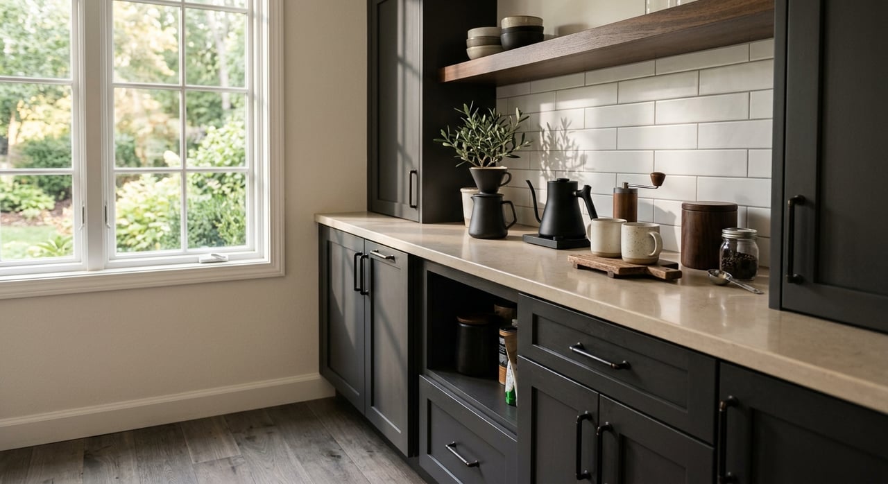
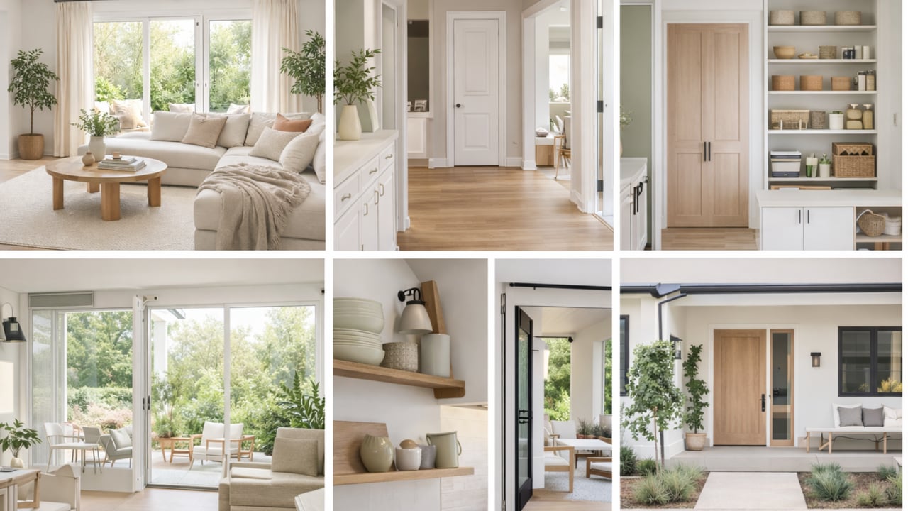
They’re calling it Cloud Dancer, and the more you sit with it, the more it clicks. It’s not stark. It’s not cold. It’s that soft, balanced white that makes a house feel calmer the second you walk in. The kind of white that lets everything else breathe.
But Pantone didn’t do this in a vacuum. Almost every brand leaned into the same idea this year: comfort and grounding.
James Hardie went dark and stormy with Iron Gray for exteriors. Super moody, super strong, especially with warm wood. It feels modern without feeling sterile. Like, “I care about design, but I also want my house to feel solid.”
Benjamin Moore’s Silhouette is basically that same energy, but for interiors. Deep, brown-meets-charcoal, very grown-up. Not a color you throw everywhere, but when it’s done right, it feels expensive.
Sherwin-Williams and HGTV played it safer with Universal Khaki. It grounds big spaces. Works with wood, stone, old houses, new houses pretty much everything.
And then there’s the return of brown… which I know sounds scary until you actually see it done well.
Between Coffee Bean, Warm Mahogany, and Special Walnut, it’s pretty clear we’re done pretending everything needs to be light, blonde, and washed out. People want depth again. Warmth. Stuff that feels like it has a little history.
Greens are still everywhere. Behr’s Hidden Gem is a smoky blue-green that somehow feels bold and calming at the same time. Valspar’s Warm Eucalyptus leans sage, familiar, cozy, almost retro. These are colors you can actually live with, not just admire on Instagram.
But here’s the bigger takeaway, and this is the part that matters even if you don’t care about paint.
All of these colors point to the same shift: homes are moving away from trying to impress… and back toward trying to feel good.
Calm. Cozy. Grounded. Intentional.
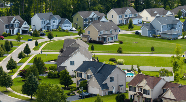
And in real estate, homes that feel neutral but warm photograph better, show better, and help buyers picture their own life there instead of getting distracted by a bold choice they don’t love.
If you're thinking of selling your home in Worcester, Grafton, Auburn, Shrewsbury, Northborough, anywhere in Central Massachusetts, I'm here to help! Send me an email at [email protected] and I'll email you my 2026 Paint Guide!